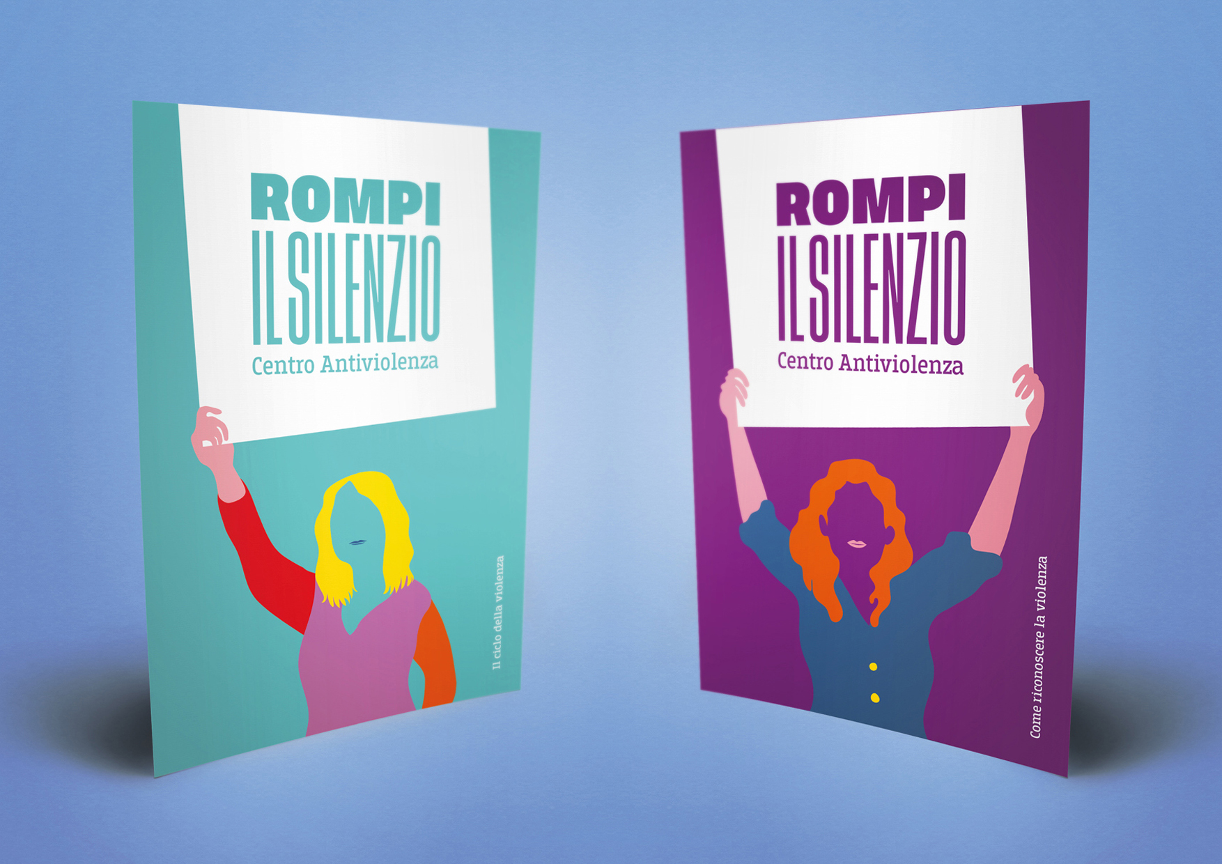
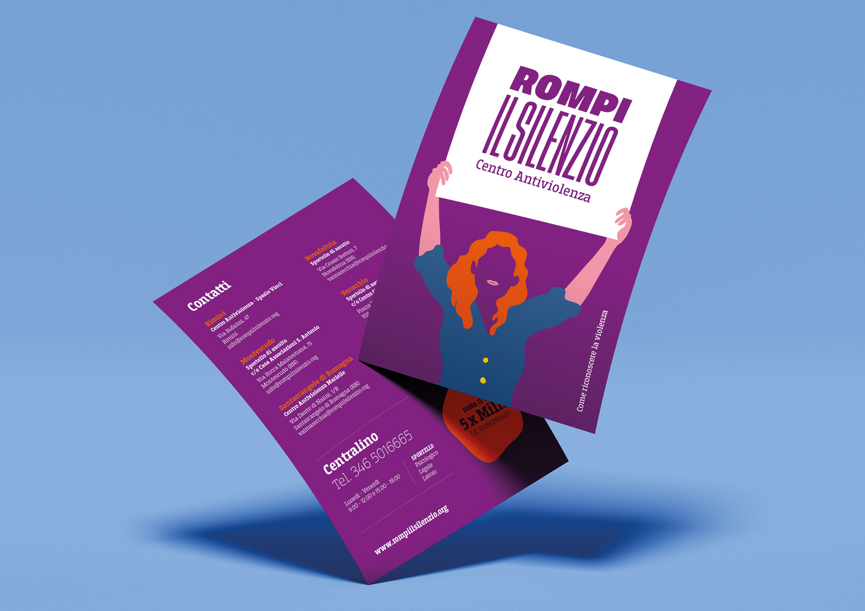
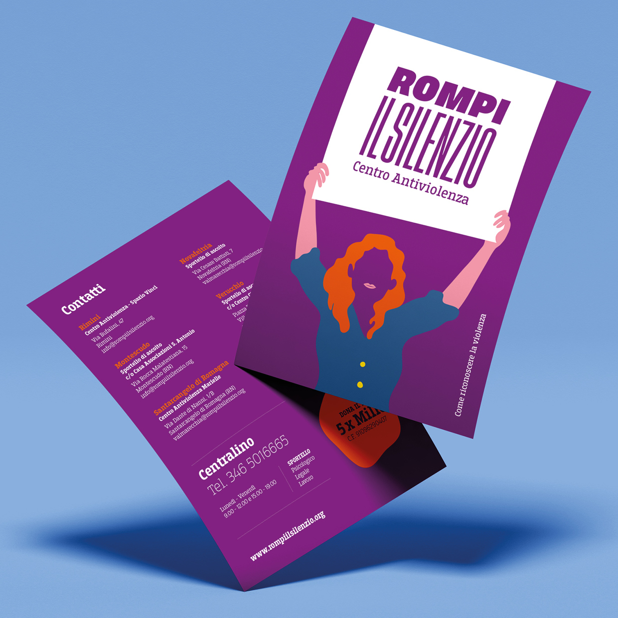
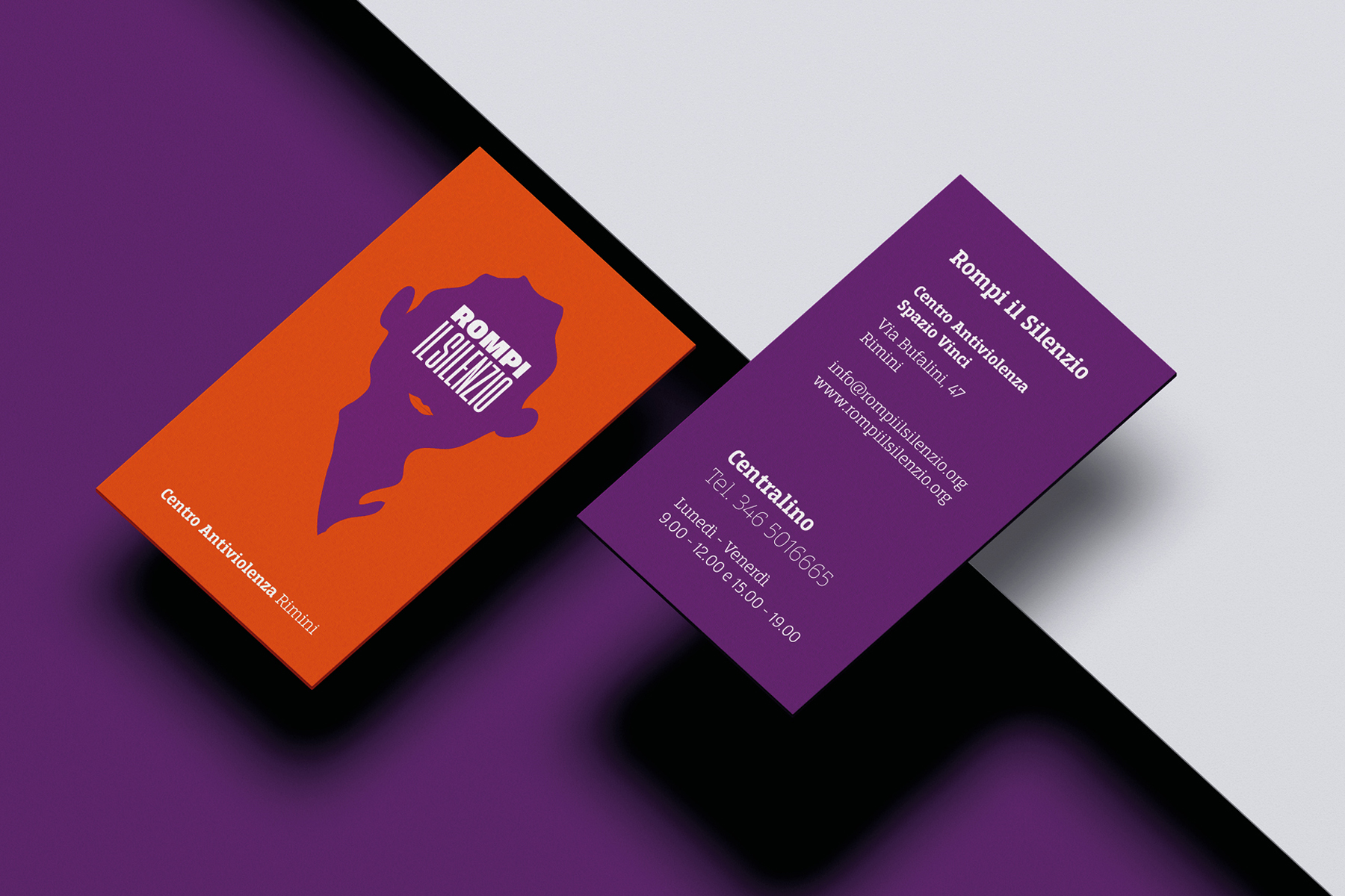
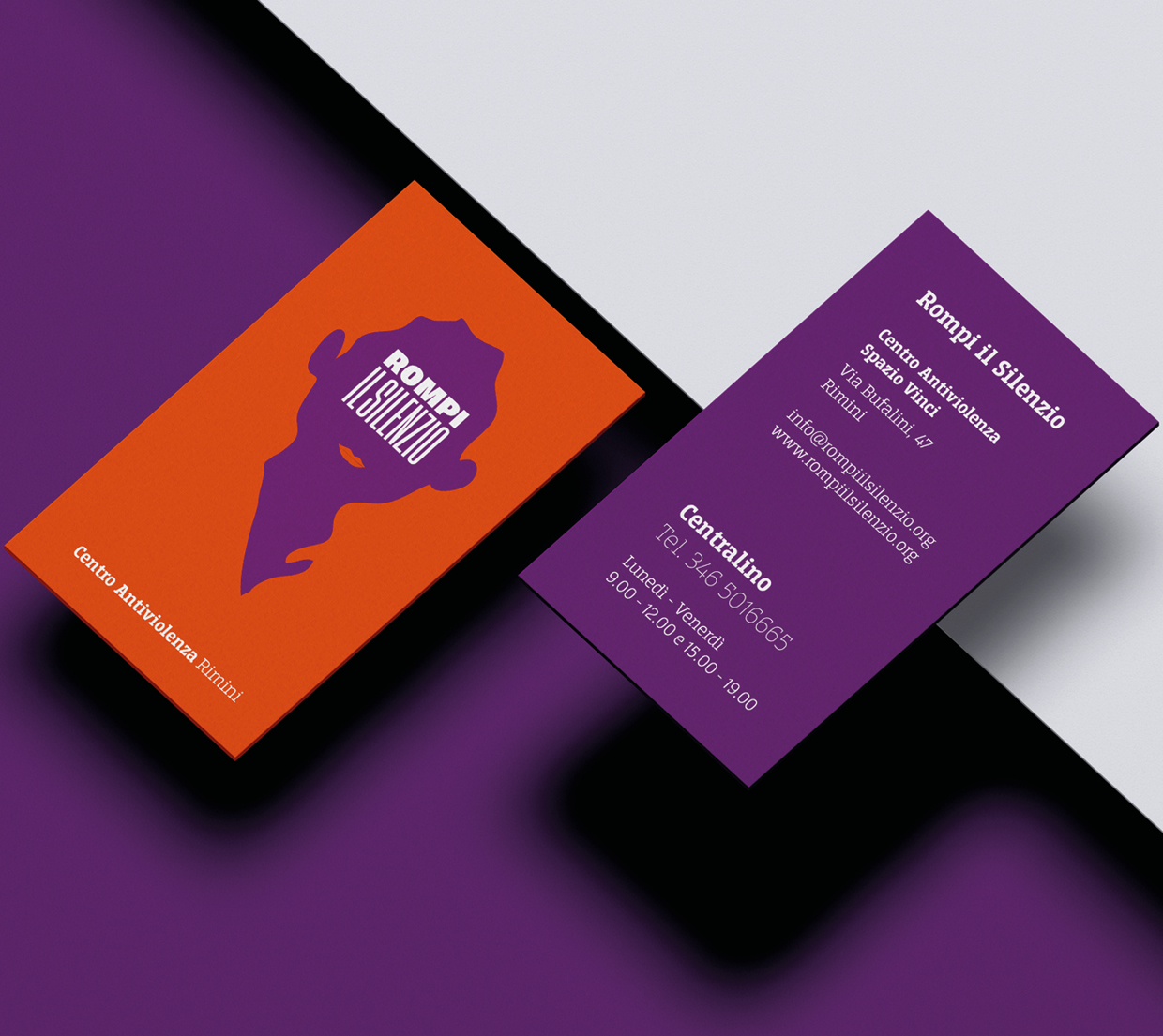
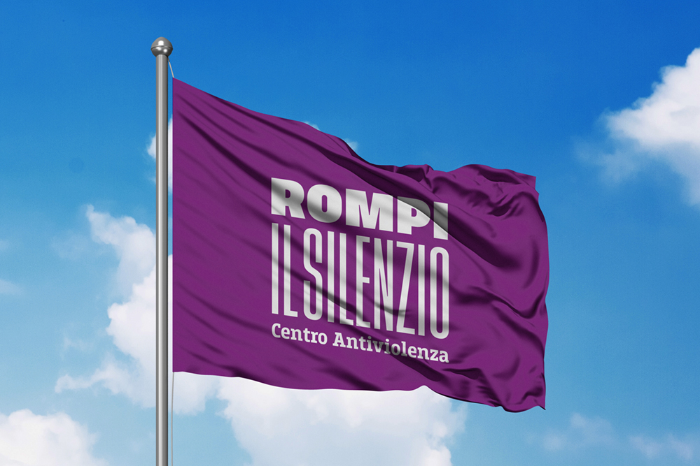
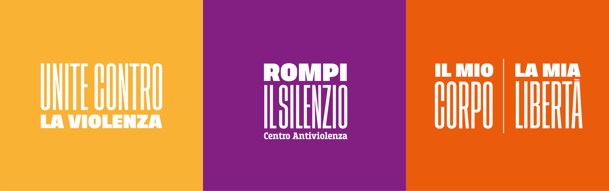
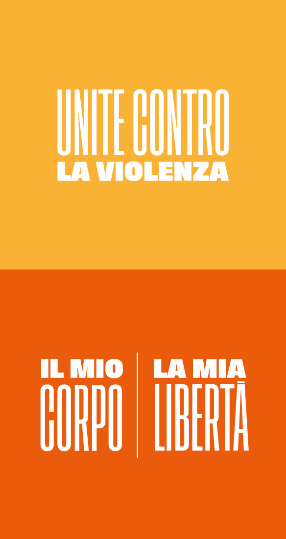
Logo: the importance of the message.
The creative process took into consideration the name of the organization and its clear and incisive identity. The logo was designed so as to emphasize the message of advocacy, finding its expression in the use of a compact, easily readable font that highlights the strength of the organization’s name and slogan.
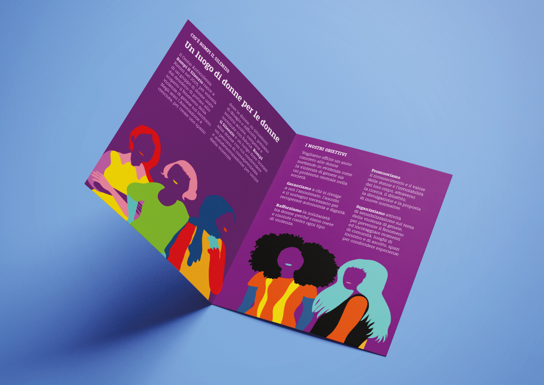
All the elements of the visual identity were developed in parallel so as to be coordinated, creating a dialogue between the various elements that reference each other.
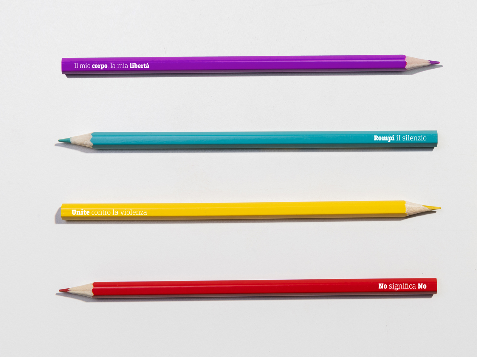
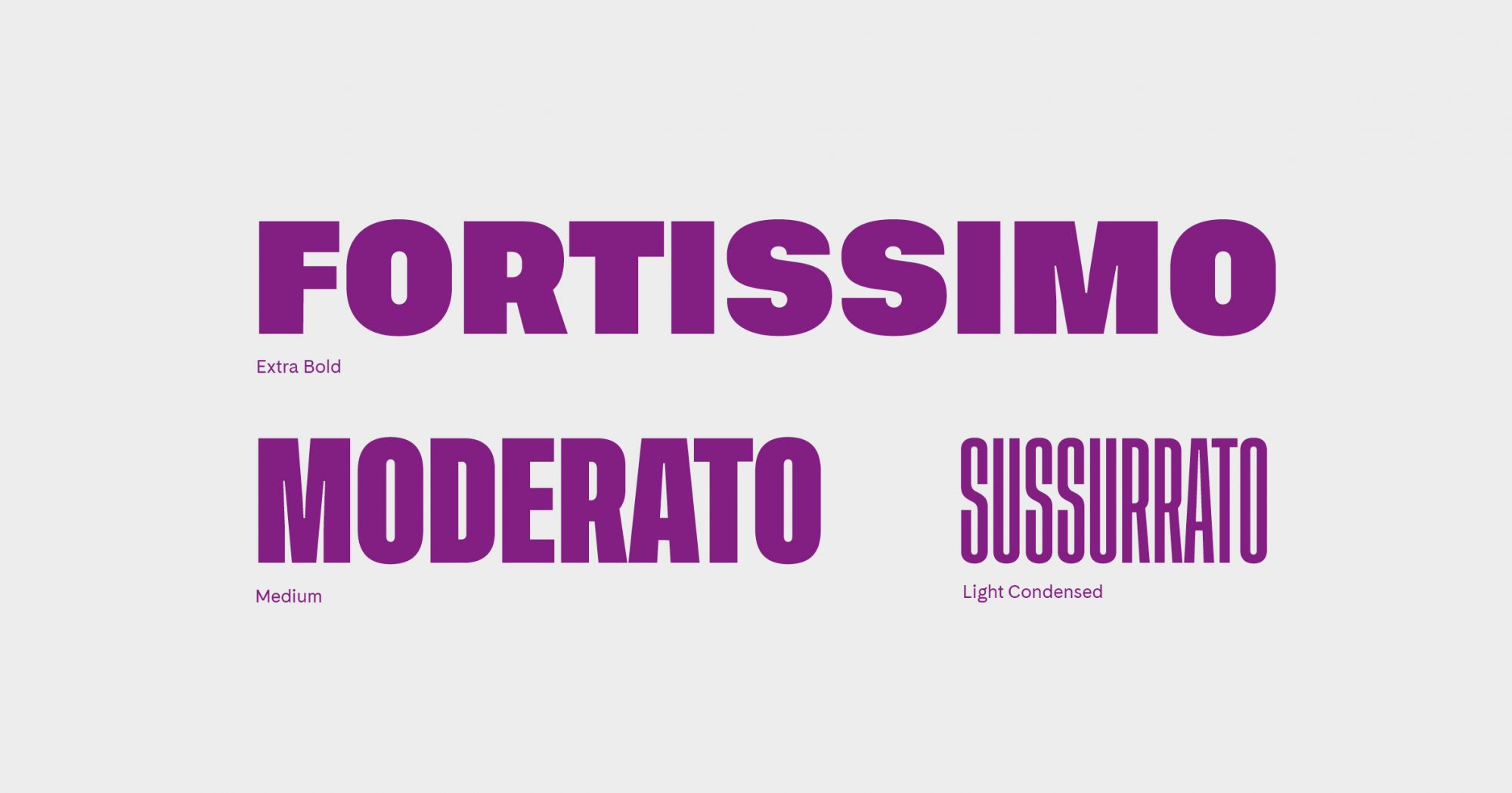
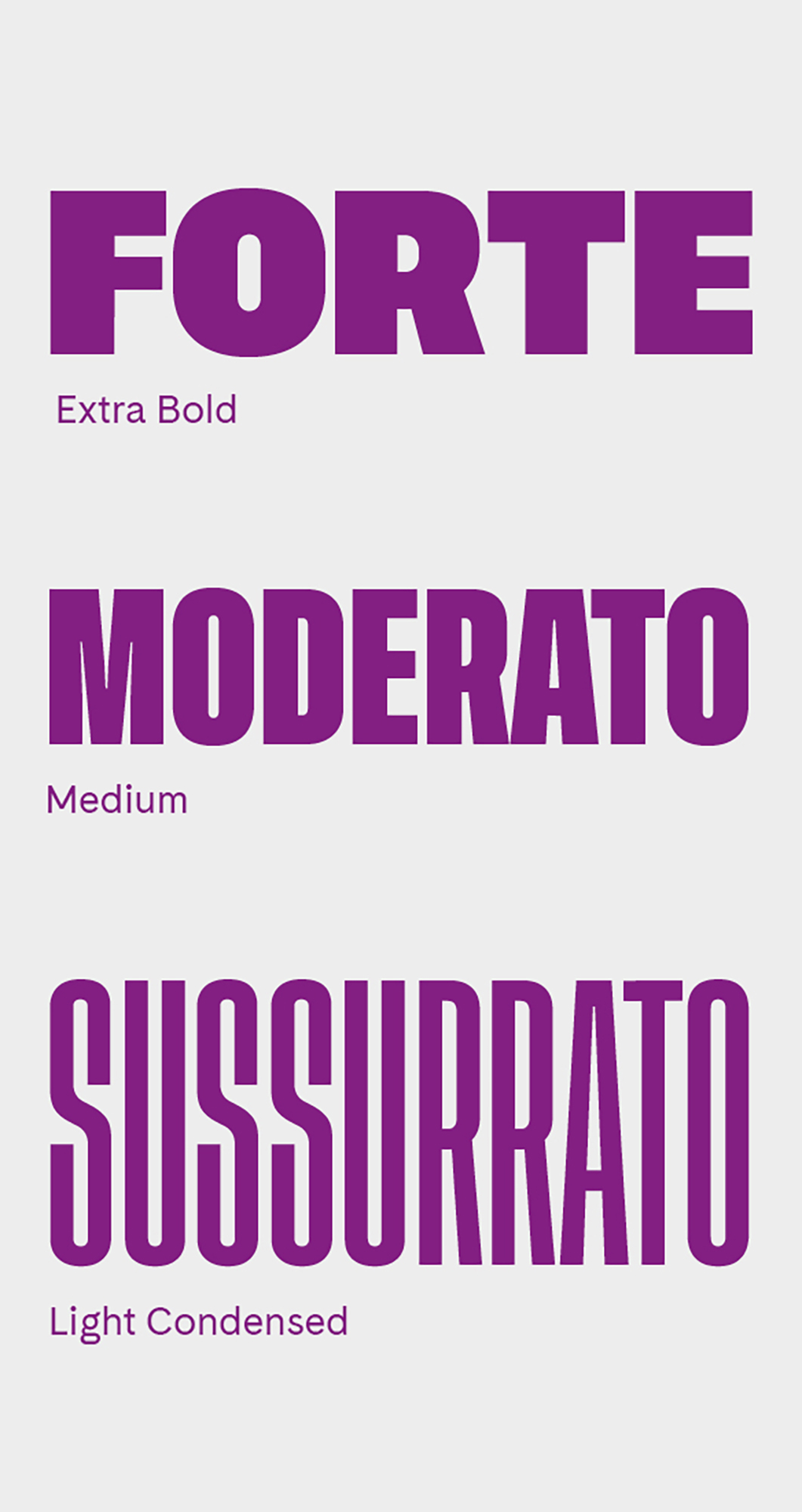
Font: strength and determination.
The design and choice of fonts privileged high readability of the slogan and easy fruition of the informative content, to promote taking action against gender-based violence.
Turning up the volume on fonts
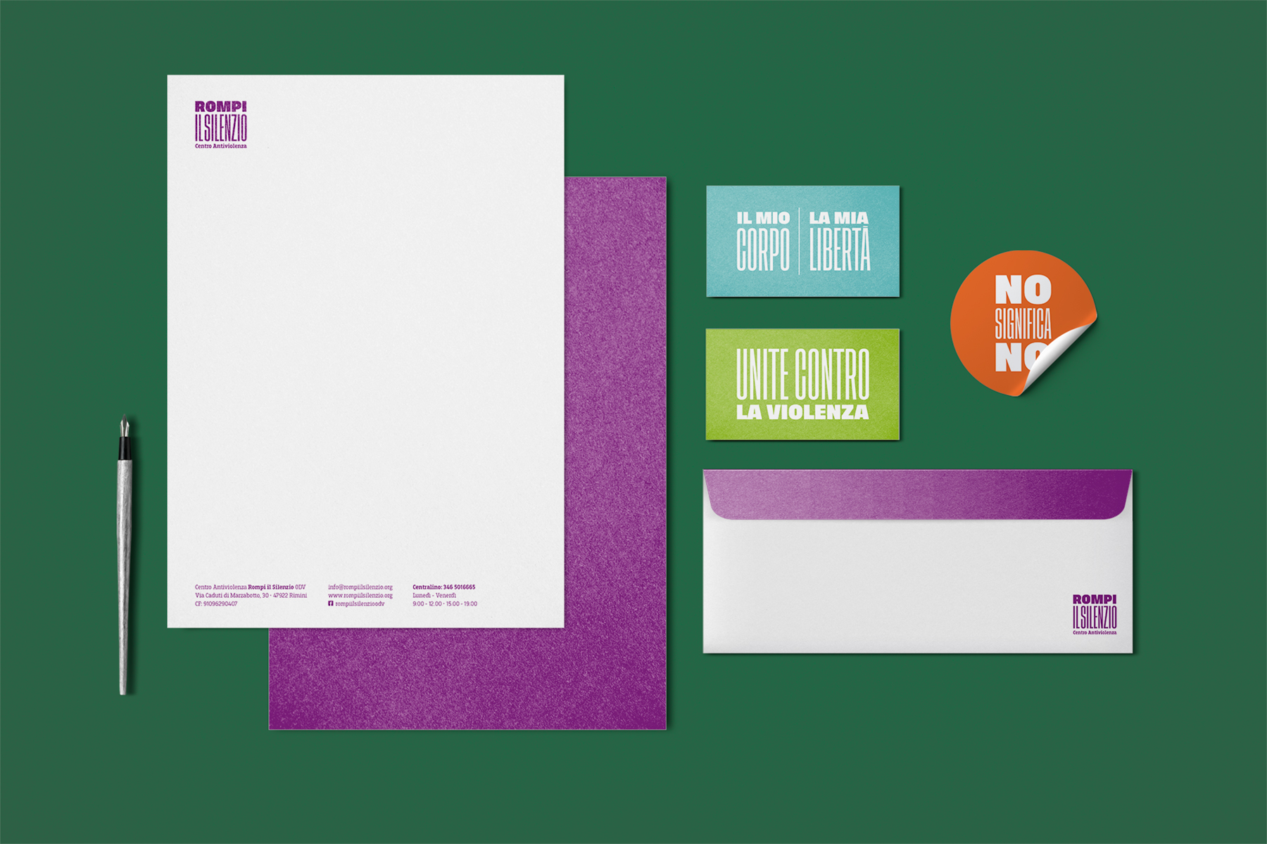
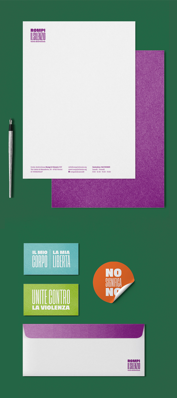
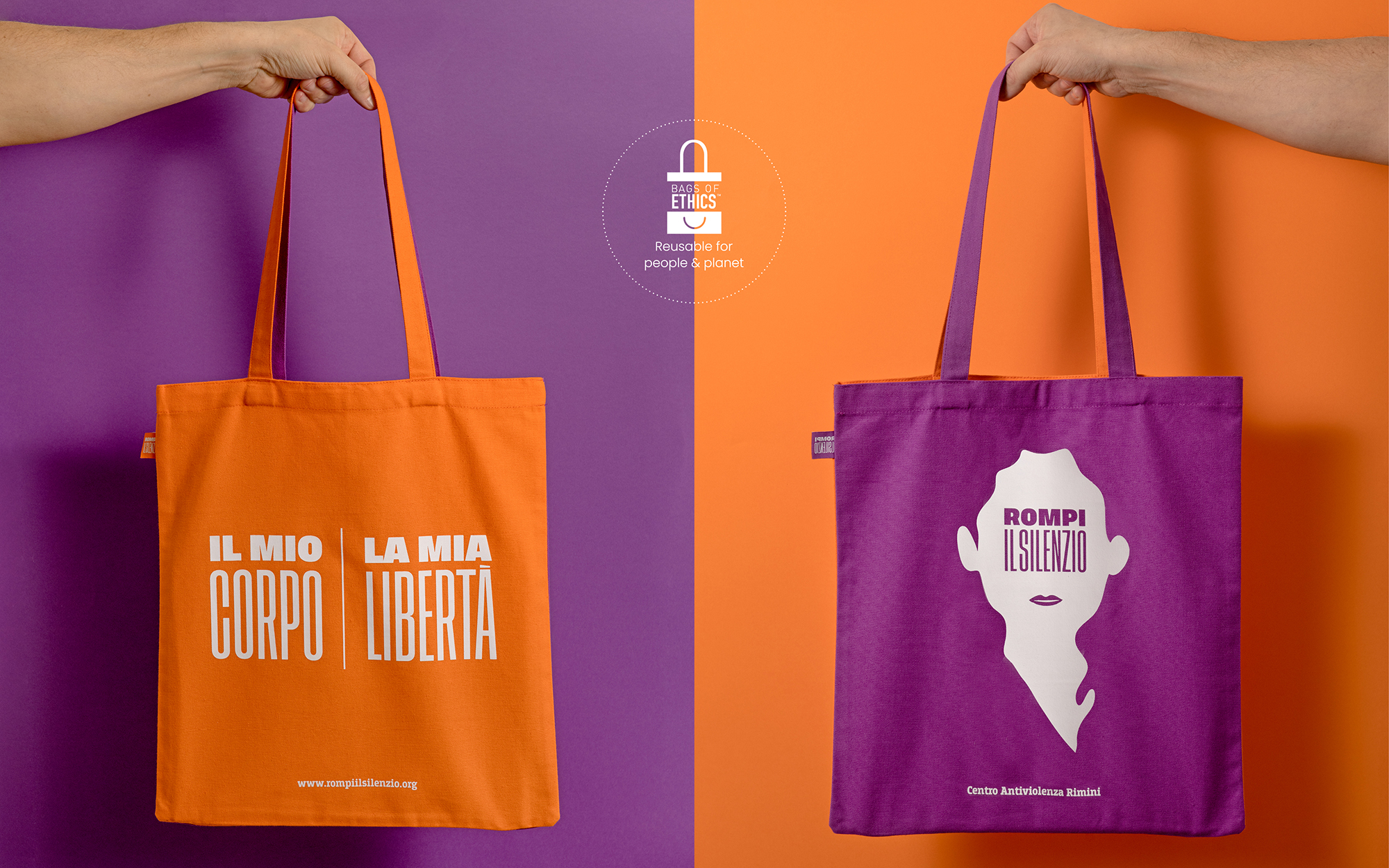
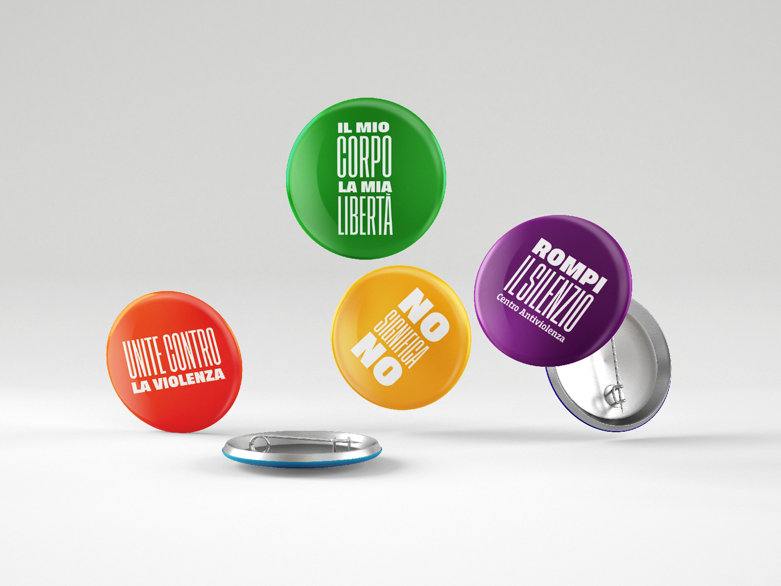
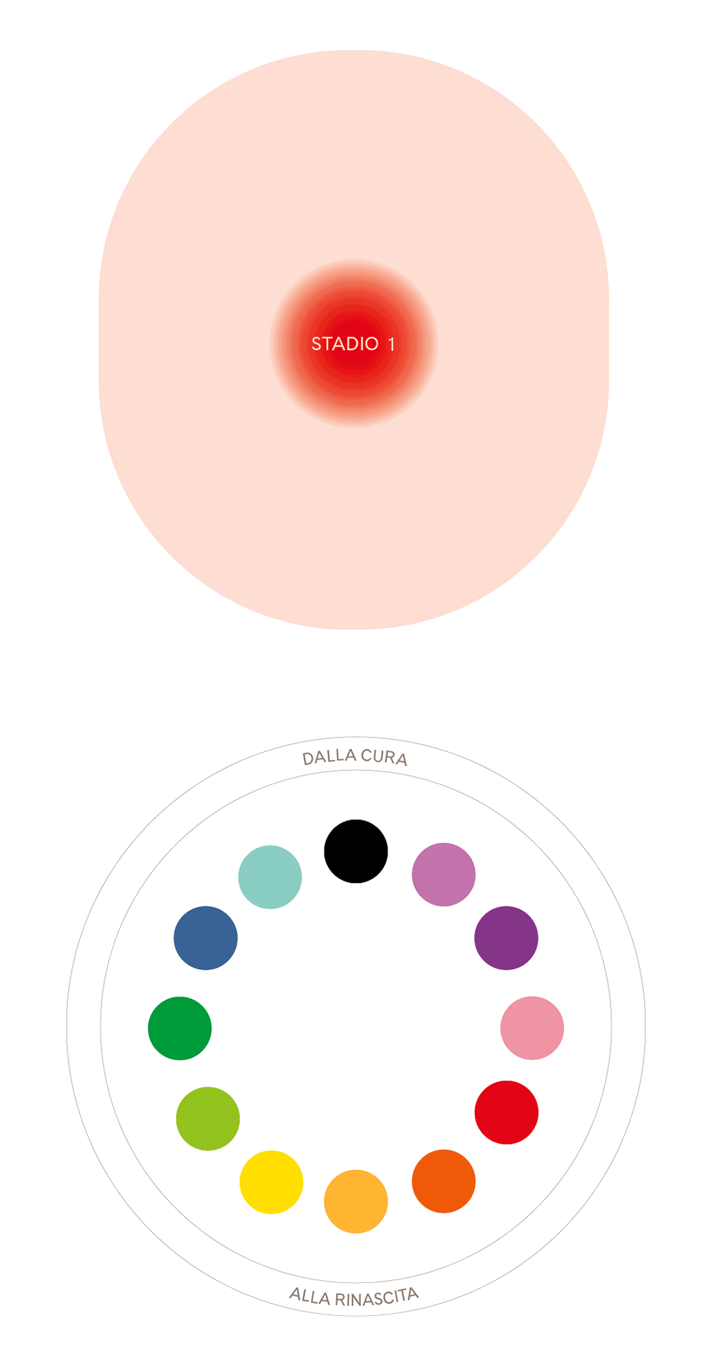
Colors: the healing process.
The starting palette was composed of two colors: green and purple, associated with bruising and the evident marks of domestic abuse. Yet they are also signs that the healing process has begun, and this positive aspect was developed to create a wider chromatic range that could evoke the idea of rebirth.
.gif)
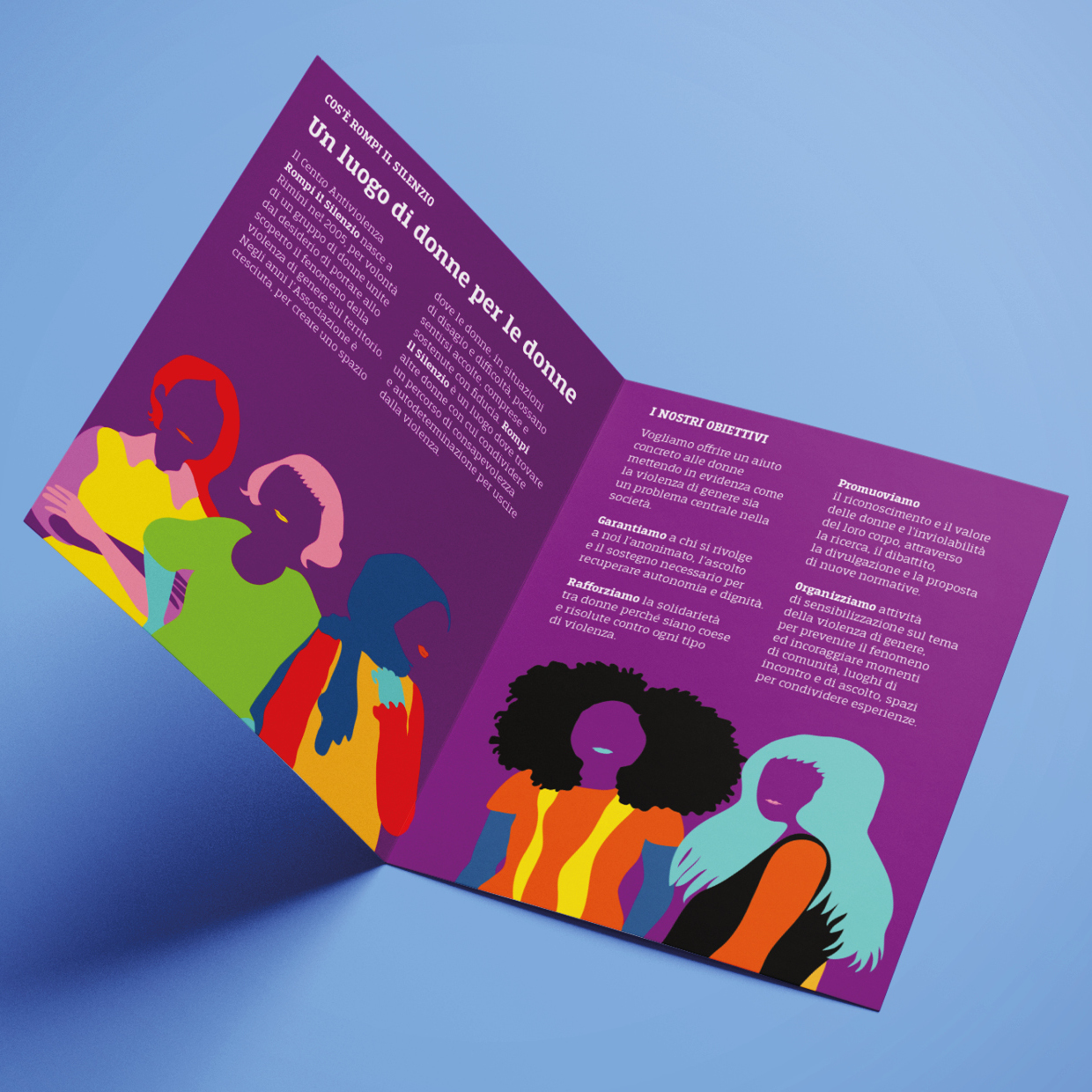
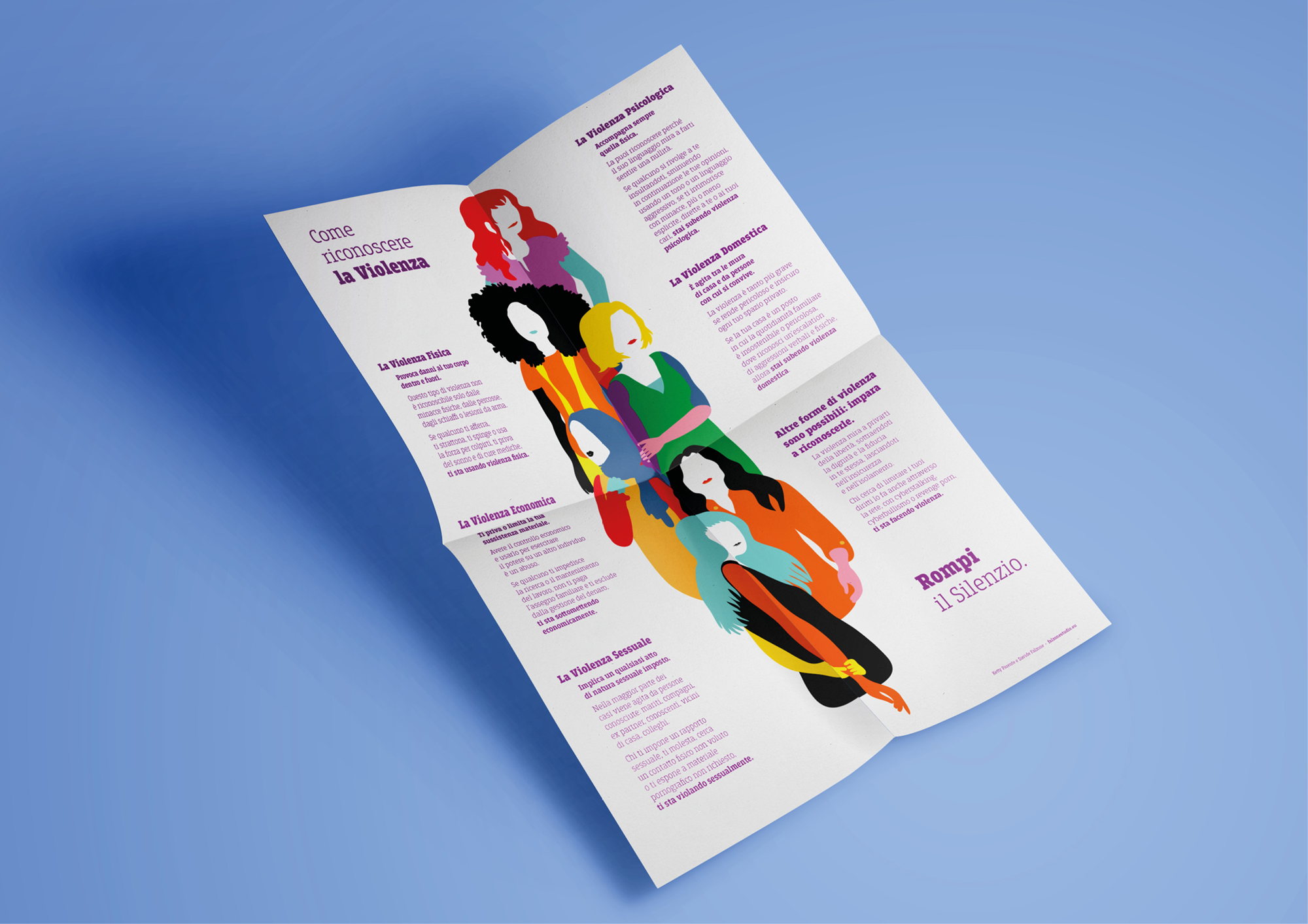
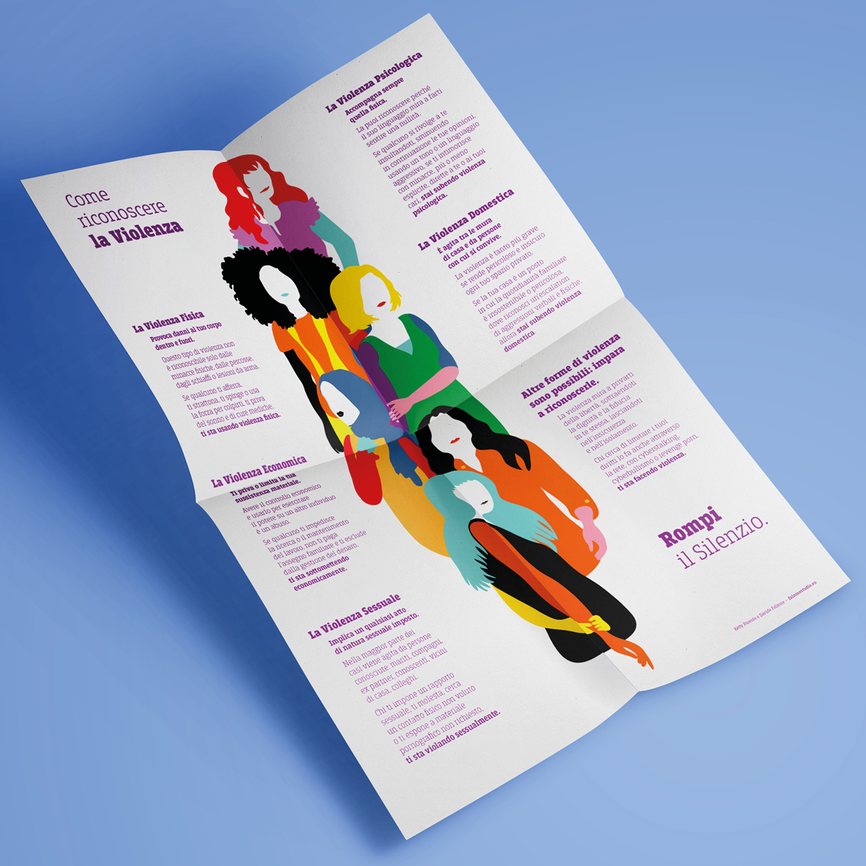
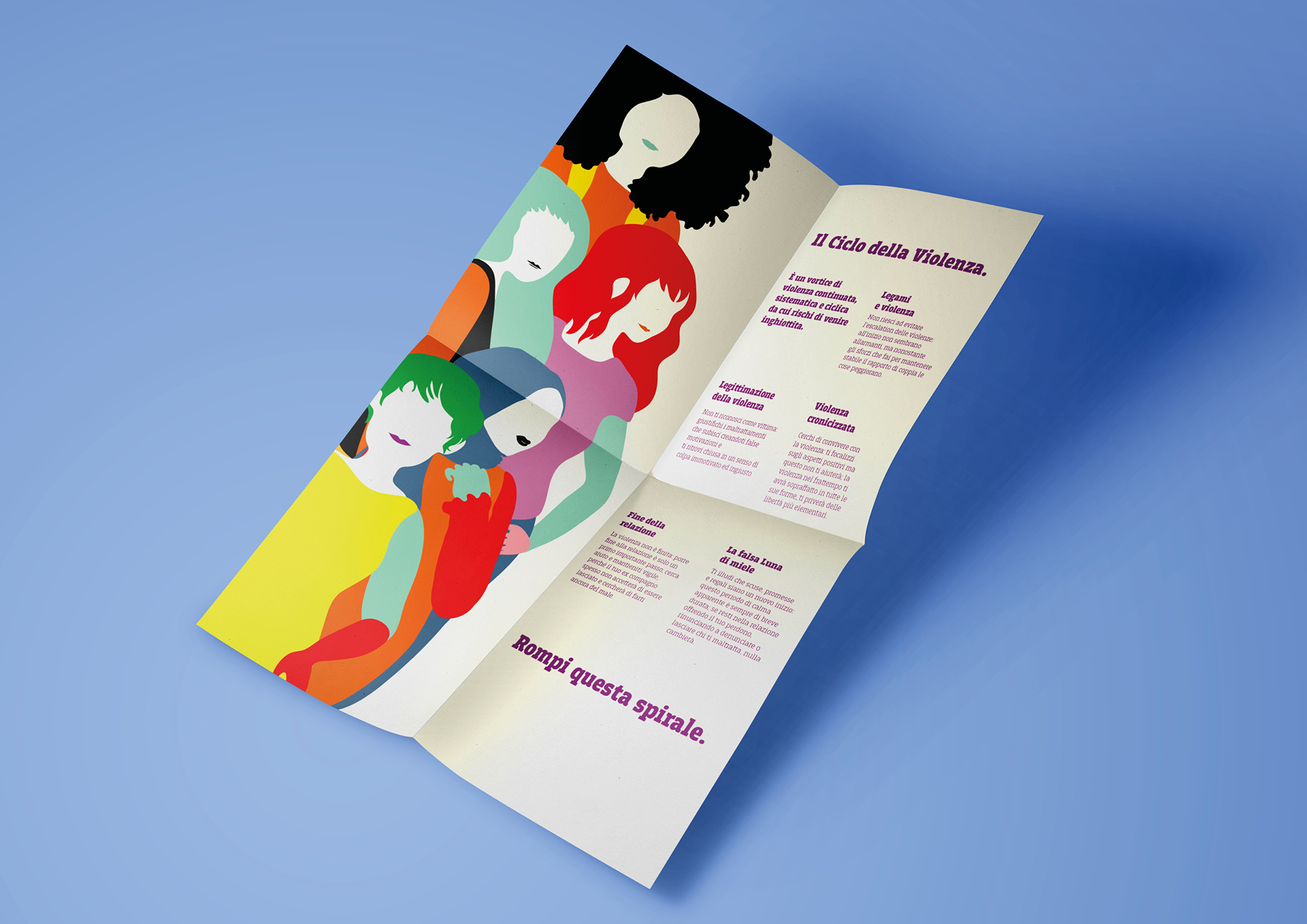
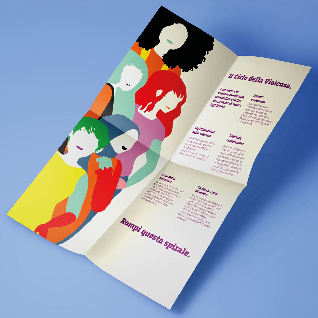
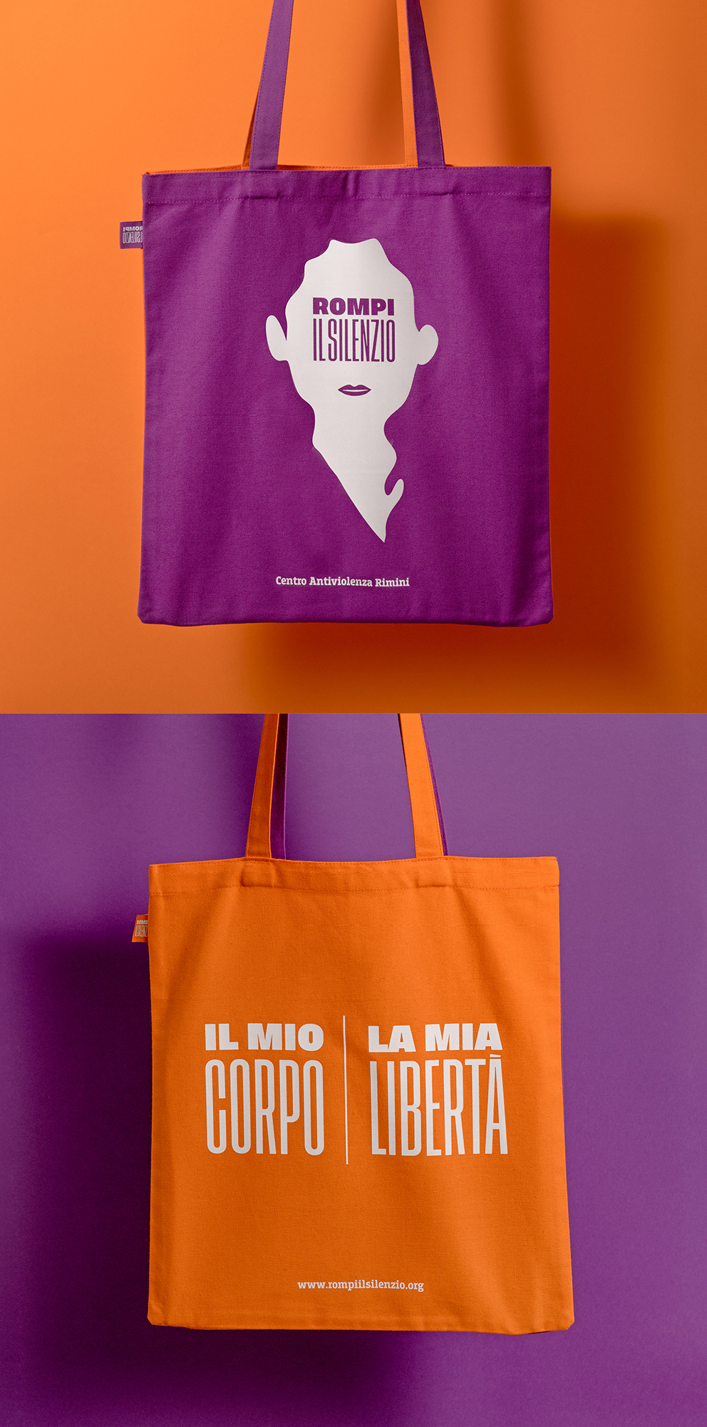
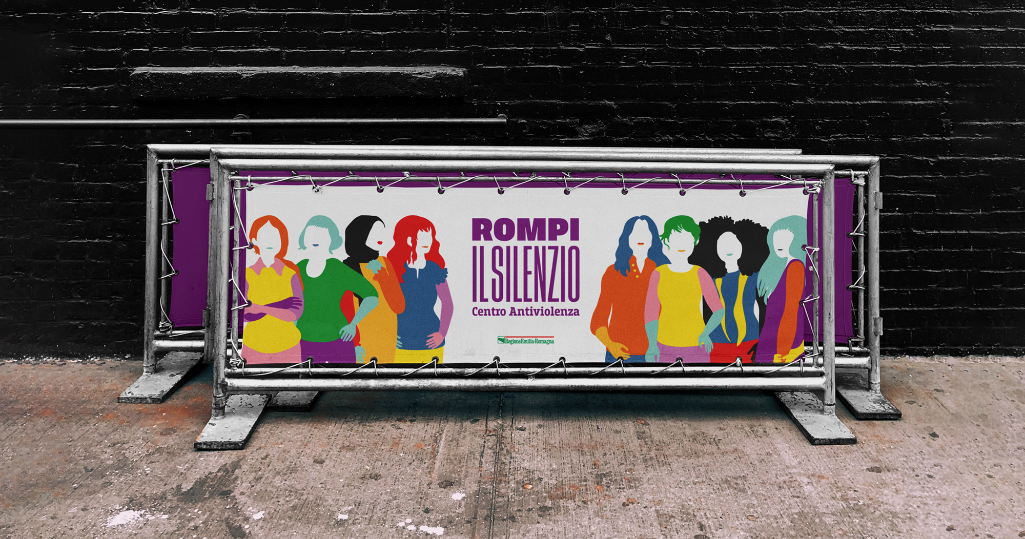
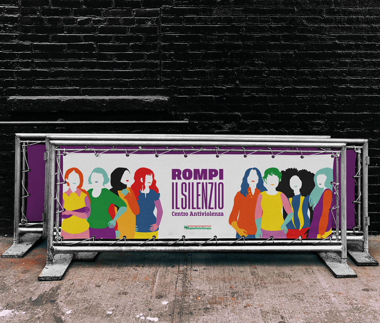
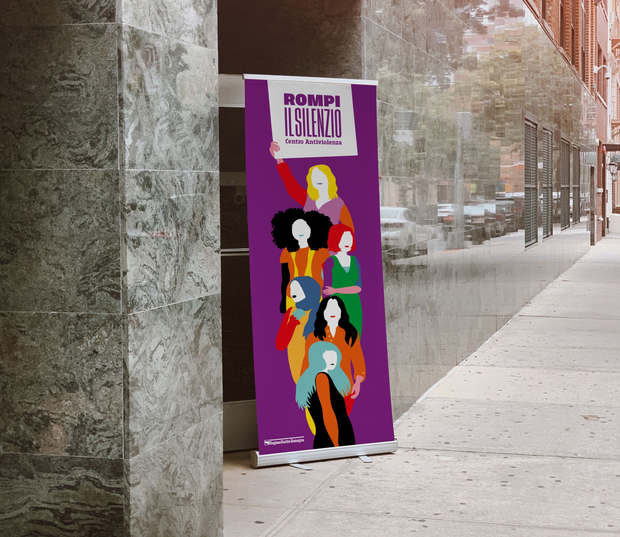
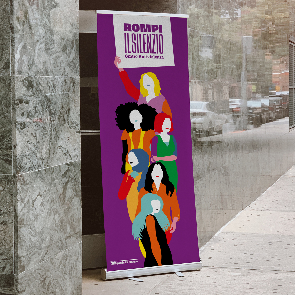
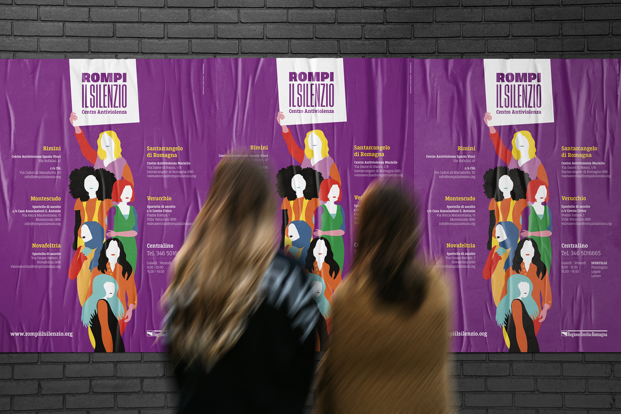
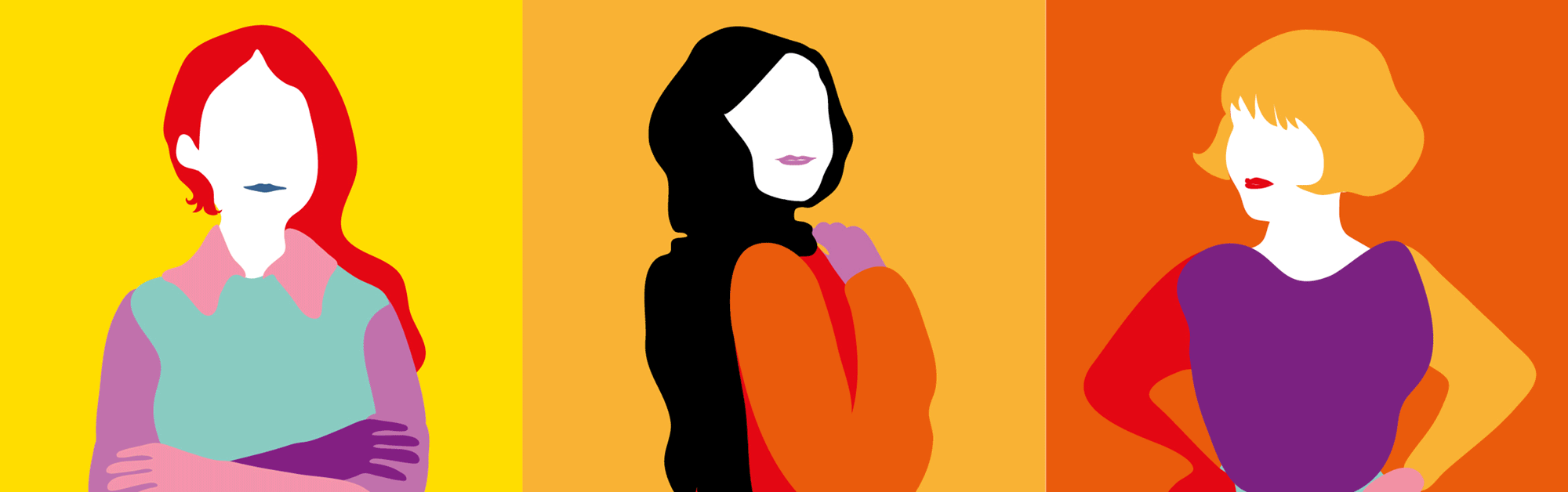
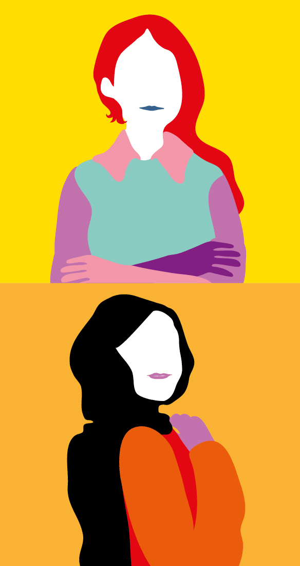
Illustrations: easy to identify with.
The subjects of the illustrations are female figures without a face – violence destroys identity – but they have a mouth with which they can express themselves, reach out, and report abuse. We are the stories and experiences we share.
The pose of the silhouettes is frontal and was designed to appear welcoming, reassuring and non-threatening.
The compositions are modular so that the message of unity and support is always at the forefront.
The shapes and colors represent various cultural identities, as violence against women is a universal issue.
The use of vector drawings allows the figures to be filled in or left empty, thus being easily translatable into different formats and tailored to meet various needs.
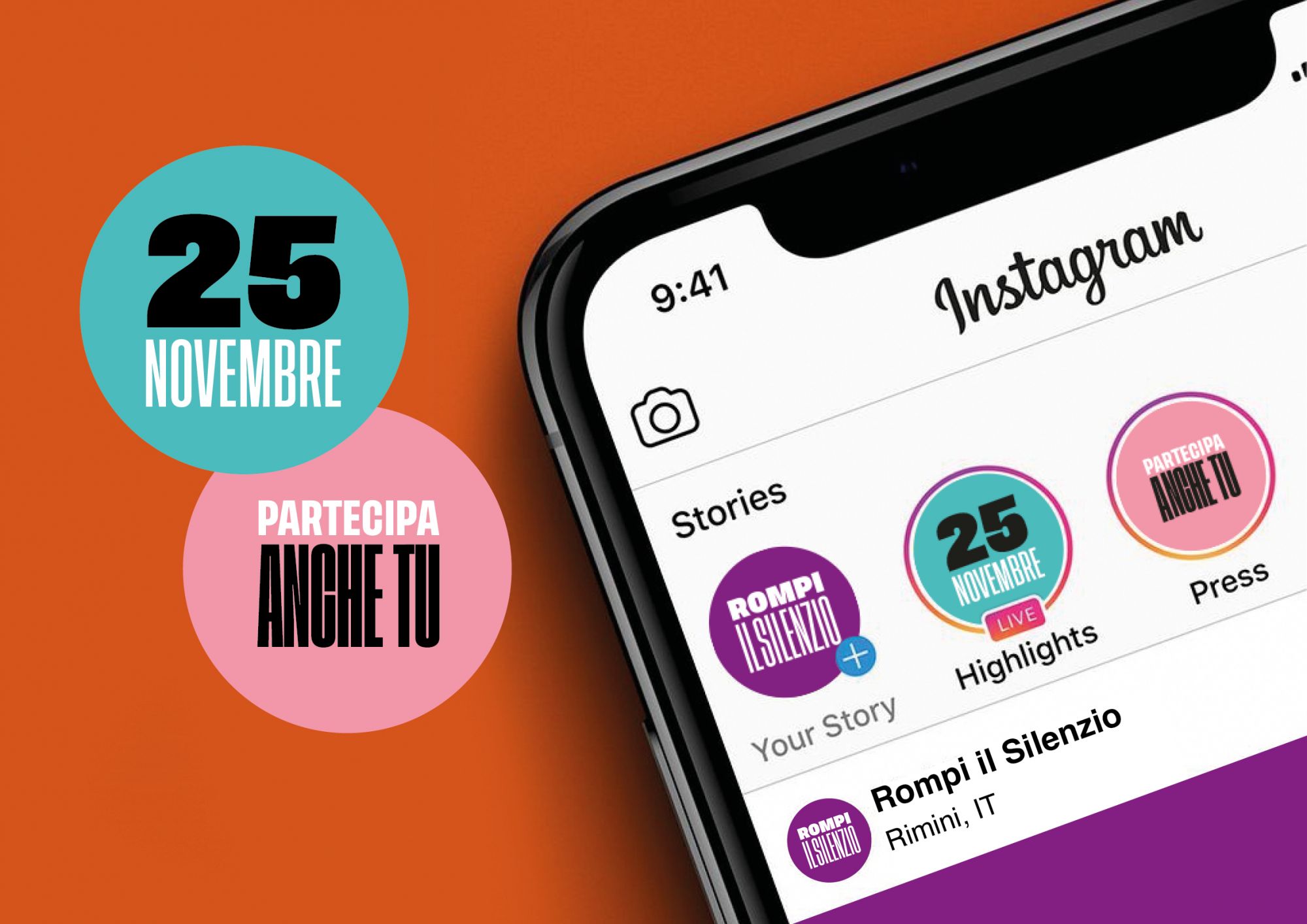
Communication media